“Blue” for Go? Exploring Japanese Colors
Culture- English
- 日本語
- 简体字
- 繁體字
- Français
- Español
- العربية
- Русский
Shifting Color Meanings
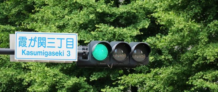
“Blue” traffic lights come as a shock to many students of Japanese. If one learns that midori is “green” and ao is “blue,” it is surprising to find that the clearly green traffic lights at Japanese intersections are described as aoshingō. This demonstrates that even common words may not have simple translations. Japanese traffic lights are not actually blue; they are ao, a word that usually means “blue” but can also mean “green.”
Ao, one of the oldest color words in Japanese, was once much broader in application. In several still common words, it denotes the vivid green of fresh vegetation, as in early summer. Examples include aoba (fresh foliage), aona (leafy green vegetables), aomame (green soybeans or peas), and even the prefectural name Aomori, which according to one explanation originally referred to the green juniper bushes covering a small hill in what is now the prefectural capital. The word ao has also been used historically for a broad range of colors tending toward other shades, including black, white, and gray.
The shifting meanings of the past can be fascinating, if potentially confusing. In the earliest records of the Japanese language, ao and aka (now red) were indicators of brightness. While kuro (black) denoted darkness and shiro (white) light, ao was used for darker and aka for brighter shades in between. Just as kuro and kurai (dark) share the same etymological root, aka is related to akarui (bright).
Long after much of this early linguistic uncertainty had settled down, the use of ao to mean “green” persisted into the age of traffic lights. Japan’s first electric traffic light was installed in Hibiya, Tokyo, in 1930. It was imported from the United States and featured the three standard colors. The original legislation actually designated the “go” color as midori, but the Japanese public insisted on calling it ao and the naming stuck. In 1947 aoshingō was written into Japanese law as the official name of the “go” signal.
A Colorful Tradition
English influences colors as it shapes other parts of the Japanese language. It might seem unlikely that burū (blue) and gurīn (green) could ever replace ao and midori, even though the katakana terms are now often heard. Yet orenji (orange) is arguably more used than the traditional daidai, which takes its name from a similar citrus fruit. Pinku (pink) is also firmly entrenched in the language, and more common than its loose synonym momo (peach).
The Japanese color shu (vermilion) is sometimes described simply as “red” or occasionally “orange,” the lack of precision reflecting its lesser importance in the English-speaking world. In Japan, though, as in other parts of East Asia, it is deeply rooted in the culture. It is the color of torii gates at Shintō shrines, the shuniku inkpads paired with personal seals, and the ink used by calligraphy teachers when annotating students’ work. It is also a common color for lacquerware.
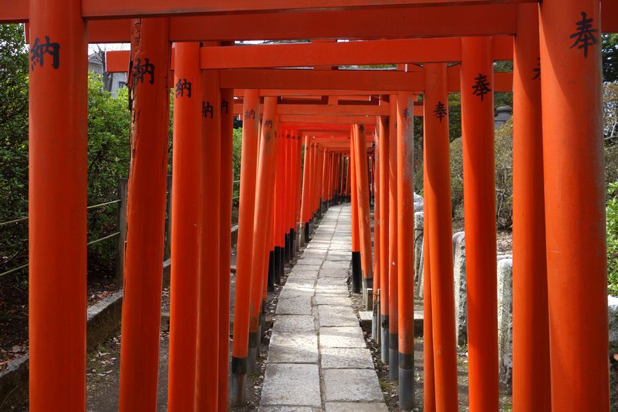 Vermilion torii gates adorn a pathway at Tokyo’s Nezu Shrine.
Shu is one color to catch the Western visitor’s eye, but Japan has many more traditional hues. Murasaki (purple) was long the color of clothes worn by the ruling class. In the Heian period (794–1185), the pale purple of fuji (wisteria) became prominent, in part through association with the powerful Fujiwara clan. Author Sei Shōnagon repeatedly praises the flower in her classic Heian collection The Pillow Book, as when she includes “long, richly colored clusters of wisteria blossom hanging from a pine tree” in her list of “splendid things.”
The Heian aristocracy’s keen interest in color is epitomized in the jūni hitoe ensemble worn by ladies of the court. The name literally means “12 layers,” but the number was not fixed and could reach as high as 20. The colors were visible at the sleeves and hems, where progressively shorter layers overlapped, and matching them aesthetically was a fine art. There were complex rules about what colors were suitable for each layer based on the season, the occasion, and the wearer.
A contemporary equivalent to the rule-makers of the past may perhaps be the organization that runs the Shikisai Kentei, a popular test of color knowledge. By creating multiple choice questions for budding designers and artists in a range of fields, it acts as a force for standardization. This includes quizzing test-takers on exact shades for traditional colors as defined by the Japanese Industrial Standards Committee.
Standardization makes life easier, but the pleasures of language lie in its idiosyncrasies. Although it may seem odd to native-English learners that traffic lights are “blue,” accepting this encourages a new viewpoint on the world. Each new point of knowledge about a different culture represents a small step along the road to a broader perspective.
A Palette of Traditional Japanese Colors
| beni (crimson) | moegi (yellowish green) |
| momo (peach) | hanada (light blue) |
| shu (vermilion) | ai (indigo) |
| daidai (orange) | ruri (lapis lazuli) |
| yamabuki (kerria) | fuji (wisteria) |
| uguisu (bush warbler) | nezumi (mouse) |
Note: This table displays shades defined by the Japanese Industrial Standards Committee. Historically the colors may have varied widely, especially when named after dyes, where the process can greatly affect the final color. They may also vary on different monitors. Not all have common English names.
(Originally written in English. Banner photo: an aoshingō shines against a backdrop of aoba, green leaves of early summer. Quote from Sei Shōnagon’s Pillow Book translated by Meredith McKinney.)