Creative Director Satō Kashiwa: An Eye for the Iconic
Culture
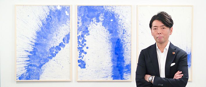
Satō Kashiwa
Creative director; visiting professor, Faculty of Environmental and Information Studies, Keio University; visiting professor, Tama Art University. Born in 1965. Graduated from the Department of Graphic Design,Tama Art University. After 11 years at advertising giant Hakuhōdō, opened his own studio, Samurai, in 2000. Professional services range from graphic design and product design to art direction, branding, and spatial planning. Author of Satō Kashiwa no chō seiri jutsu (Satō Kashiwa’s Ultimate Art of Pinpointing the Essentials), Satō Kashiwa no uchiawase (Satō Kashiwa’s Planning Meetings), and other works. Winner of numerous awards, including the Mainichi Design Award, Asahi Advertising Grand Prix, and Design for Asia Award. Appointed fiscal 2016 Japan cultural envoy by the Agency for Cultural Affairs. http://kashiwasato.com/
- English
- 日本語
- 简体字
- 繁體字
- Français
- Español
- العربية
- Русский
Even in a country renowned for its achievements in the area of visual design, the work of creative director Satō Kashiwa has left an indelible impression. Since launching his own design studio, Samurai, in 2000, Satō has risen to the top ranks of his profession with services ranging from logo and product design to the orchestration of comprehensive branding strategies and even architectural design direction for such wide-ranging and high-profile clients as Honda; the National Art Center, Tokyo; Seven-Eleven Japan; NTT Docomo; Uniqlo; and Meiji Gakuin University. In a globalized market awash in digital information, Satō has honed an approach he calls “iconic branding.” The idea is to identify a core message and design an icon—a potent anchor image or symbol—to convey that message succinctly and instantaneously across linguistic and cultural barriers.
Logos can function as icons, of course, but so can products, buildings, and even architectural spaces. So, what makes any of these things an icon? In the following, Satō offers valuable insight through his own commentary on some of his most “iconic” achievements to date.
Uniqlo’s Iconic Logo
Among Satō’s earliest and most successful forays into iconic branding was his work for Japanese apparel retailer Uniqlo. Satō was initially tapped by Uniqlo to serve as creative director for its global flagship store in Manhattan, which opened in November 2006. From there he took charge of a global branding campaign that moved on to London, Paris, and Shanghai. Anchoring Satō’s branding strategy was an iconic logo based his own original bilingual font.
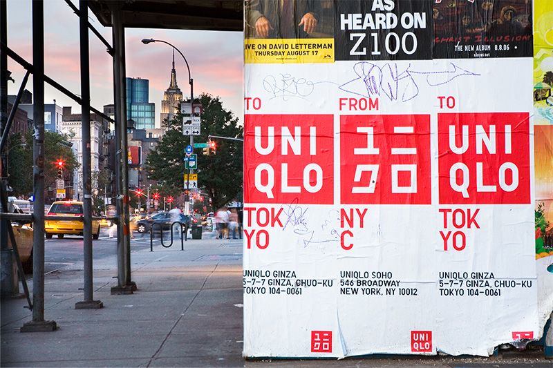 Banners adorned with Satō’s stylish new logo announce the gala opening of Uniqlo’s global flagship store in the Soho district of New York City in late 2006.
SATŌ This was a time when apparel brands like GAP and H&M were making big gains globally. Uniqlo needed a core image that expressed its rational, practical approach to clothing as “components of dress” and also its “direct from Japan” fashion aesthetic. I felt intuitively that katakana characters would work best as the key visual. Katakana embodies the inorganic quality of Japanese pop culture right now, as opposed to the soft, organic feeling of traditional culture. I was after a kind of “exquisite incongruity” that would elicit a double take from Japanese and foreign consumers alike. The fact that it ended up working just as envisioned on busy streets in cities around the world gave my confidence a boost. It proved that you could control a brand’s image very precisely through visual signals like font and color. For me, that experience was a powerful demonstration of the power of icons.
Fuji Kindergarten’s Iconic Space
Satō has not confined his efforts to the realm of commerce. Tapped as creative director by Fuji Kindergarten in the Tokyo suburb of Tachikawa in 2004, Satō set about applying the concept of iconic branding to the architectural space of a school. In doing so, he provided the kindergarten with an innovative solution to the dual challenge of renovating aging facilities and boosting enrollment in the era of the “baby bust.”
SATŌ My work as creative director is about devising solutions to problems. I always start by zeroing in on the essential nature of the problem. In this case, I visited a number of well-regarded kindergartens, and I saw what a central place the playground occupies in the space of the school. Fuji Kindergarten had a big Japanese elm equipped with a treehouse, and when I climbed up into it, it gave me such a happy feeling. That’s when I got the inspiration for a school building conceived as a giant playground—a space that would be so much fun just to run around in that kids would look forward to going to school each day. I sketched a “grand concept,” and then I got together with architects Tezuka Takaharu and Tezuka Yui to work it into a viable architectural plan. The result was the donut-shaped school building you see today.
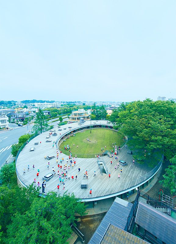 The redesigned Fuji Kindergarten, completed in 2007 under the creative direction of Satō Kashiwa, features a donut shape and a wooden roof that functions as a spacious play area.
Fuji Kindergarten’s donut-shaped building was completed in 2007 under Satō’s creative direction, and the newly rebranded kindergarten was quickly flooded with applicants. In 2010, the OECD’s Center for Effective Learning Environments selected Fuji Kindergarten as the most outstanding of 166 "exemplary educational facilities" from 33 countries.
SATŌ I think the clarity and simplicity of the concept account for its global appeal. It convinced me that iconic branding could apply to architectural space as well.

Capturing the Essence of Towel Value
Satō’s problem-solving approach also informed the rebranding project he undertook for Imabari towels, a mainstay of the local economy of Ehime Prefecture. Despite world-class technology and a superior product, the Imabari towel industry was struggling in the face of cheap foreign competition—a problem facing many local industries in Japan. What was Satō’s solution?
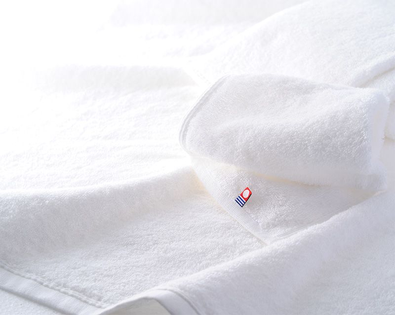 Satō designed his Imabari towel logo with a pure white towel in mind.
SATŌ The main claim to fame of Imabari towels at the time was a manufacturing technology that produced complicated woven jacquard patterns. But what impressed me the most was their towels’ amazing softness and absorbency. I decided that the image of a pure white towel was the best way to distill the message of “trust, safety, quality.” So. I set about designing a logo that would show up distinctly on the white towel and serve as the anchor of my visual communication strategy. The logo’s white stands for gentleness; the blue evokes the soft water of the Imabari region and conveys trust and safety; and red is a symbol of the sun and vitality. It’s a very bright, simple mark, designed to communicate powerfully regardless of the vehicle, whether woven into the product as a monogram, hung as a store sign, printed on paper, or displayed on a smartphone screen.
Now, if I had been more of an industry insider, I might have focused on the jacquard technology. It’s not easy for people to appreciate the basics that they’ve always taken for granted. The starting point for branding is to grasp the essential value of the product or entity that you’re branding. Sometimes an outsider can see that essence more clearly than people on the inside.

Breaking Through Barriers
Recently, Satō has earned kudos for projects for two bastions of traditional Japanese culture. His approach, however, is anything but traditional. Satō commented on his work for the unveiling of a new line of Arita ceramics (commemorating the kiln’s four hundredth anniversary) and a series of gala kabuki performances celebrating the name succession (shūmei) of a popular kabuki actor.
SATŌ In my mind, these projects are also about branding. Kabuki theater and Arita ceramics are both Japanese cultural forms with four centuries of tradition and technique behind them. I want everyone to know how great they are, not just in Japan but all around the world. But for that, it’s no good just droning on about tradition and technique. For Arita ceramics, it’s about how new we can make them appear. The same is true for kabuki. I call kabuki a living heritage, with the emphasis on the living part. It’s not just a tradition; it’s a widely appreciated form of entertainment in our society today, with a huge active repertoire ranging from classics to brand-new works. I wanted to distill that essential character and philosophy and communicate it through clear, simple, unforgettable imagery.
The pace of communication today is lightning fast. You can’t expect dramatic results unless you can communicate value in an instant. And I don’t limit myself to specific media. When I took on publicity for a new album by the pop band SMAP, I used the very streets of Shibuya as a medium. I covered billboards and parked cars and everything I could think of with the cover art. So, you see, anything can function as an icon: products, buildings, even city streets.
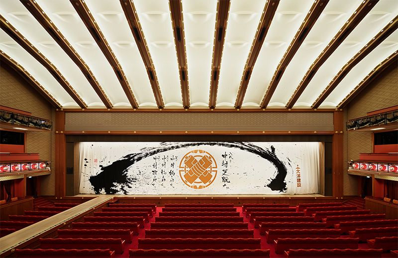 Kabukiza curtain designed by Satō Kashiwa to celebrate the shūmei (name succession) of kabuki actor Nakamura Shikan VIII.
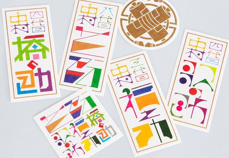 Commemorative stickers for the occasion, featuring the logo designed by Satō Kashiwa.
Communication Design as Culture
Each year the Agency for Cultural Affairs selects a group of distinguished cultural figures to represent Japan overseas. While the appointees thus far have spanned such fields as modern art, calligraphy, tea ceremony, architecture, dance, and drama, Satō is the first creative director ever named to the post. In his capacity as a Japan cultural envoy for fiscal year 2016, Satō will tour New York, London, and Paris during March and April 2017. The tour will feature lectures in each city and an exhibition of Satō’s work in Paris. The keyword throughout will be “iconic branding.”
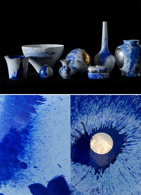 Images from Dissimilar: Arita 400, a project directed by Satō Kashiwa for Saga Prefecture to commemorate the 400th anniversary of Arita ceramics.
SATŌ For someone who has devoted his career to communication design, it’s gratifying to think that society is coming to recognize it as a form of culture. I’m looking forward to providing a fresh perspective on Japanese culture, something a little different from the “Cool Japan” approach. This tour is taking me to three cities that I love: New York, London, and Paris. I’m looking forward to Paris especially, because I sense there’s a deep affinity with Japanese culture. Even though the output is very different, I think there’s a lot of resonance in terms of our basic aesthetic sensibility.
People overseas still know surprisingly little about Japanese culture. I’m often disappointed by the blank looks I get when talking about things I assumed were common knowledge. But with icons, you can clear hurdles like that in an instant. People tend to equate communication with verbal language, but my focus is on developing the power of icons to break through communication barriers. And I’m eager to expand my practice of those methods overseas.
Satō Kashiwa Japan Cultural Envoy Tour, March–April 2017
Lectures:
Wednesday, March 22, 6:30 pm; Japan Society, New York
Monday, March 27, 6:00 pm; Royal College of Art, London
Tuesday, April 4, 6:30 pm; Maison de la culture du Japon à Paris, Paris
Exhibition:
Tuesday April 4, to Saturday April 15; Maison de la culture du Japon à Paris
(Originally written in Japanese. Photographs by Ōkouchi Tadashi and video by Hanabusa Ryō)