


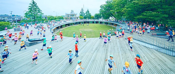
Satō Kashiwa’s ambitious “iconic branding” projects span a wide range of media, industries, and themes, but they are consistent in the freshness and dynamism of their forms and the terse eloquence of the nonverbal language they use to communicate across cultures.
Perhaps the most astonishing aspect of Satō Kashiwa’s work is its range. As creative director, Satō has redesigned corporate logos, restructured architectural spaces, rebranded cultural institutions, and even revitalized local industries.
For Satō, the job of creative direction is not about self-expression. It is the fruit of his professionalism, the product of a commitment to finding the best possible solution to the challenges facing his clients.
“It’s not the scale of your work that matters,” he says. “It’s the sharpness of the concept you deliver to society.”
The way Satō achieves sharpness is by identifying the crux of the problem and designing iconic forms that marshal the power of visual signals to break through cultural and linguistic barriers. The goal is instantaneous communication. This is the essence of the design philosophy that Satō calls “iconic branding.”
(Originally published in Japanese on March 17, 2017. Text by Kiyono Yumi. Banner photo: Fuji Kindergarten, Tachikawa, Tokyo.)
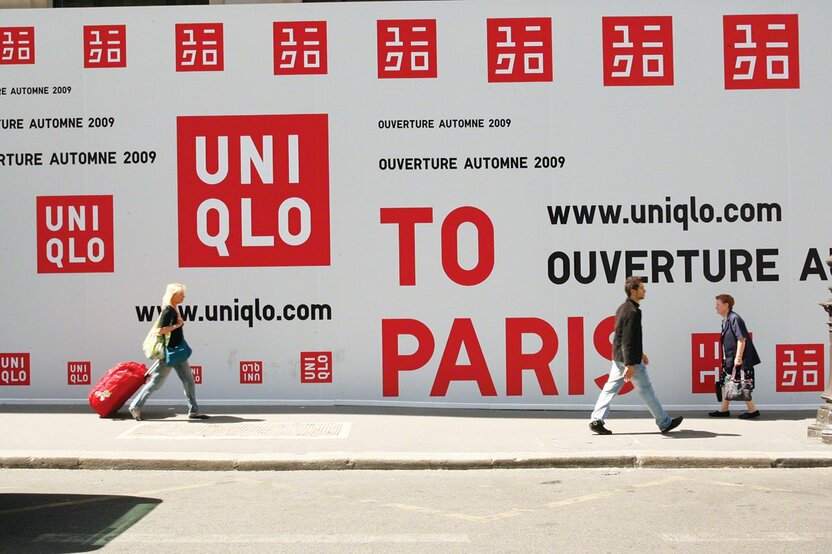
 During the publicity campaign for the opening of Uniqlo’s global flagship store in Paris (October 2009), Satō’s bold bilingual logo was plastered all over the iconic European city.
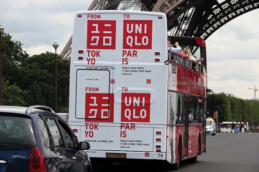 A double-decker tour bus bearing the Uniqlo logo passes beneath the Eiffel Tower.
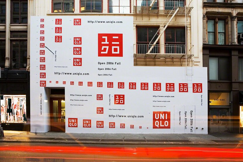 Bilingual Uniqlo logos announce the grand opening of the apparel retailer’s first global flagship store in the Soho district of Manhattan (November 2006). This was the beginning of Satō’s partnership with Uniqlo.
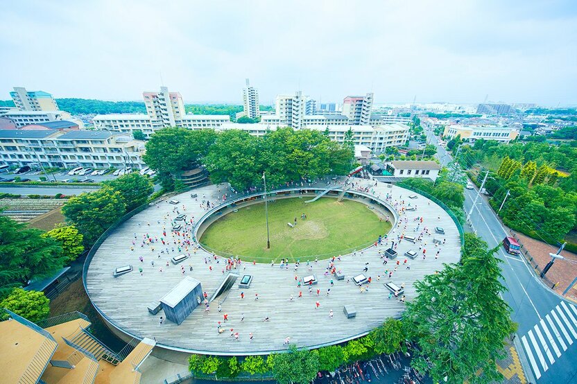 In 2004, Satō was hired to direct the rebuilding and landscaping of the aging Fuji Kindergarten in Tachikawa. Tezuka Architects completed the building plan based on Satō’s concept.
 As “total producer” for the Cup Noodles Museum (completed in 2011), Satō designed the logo, museum building, and a variety of imaginative exhibits. The museum is dedicated to Andō Momofuku, the “father of instant ramen.”
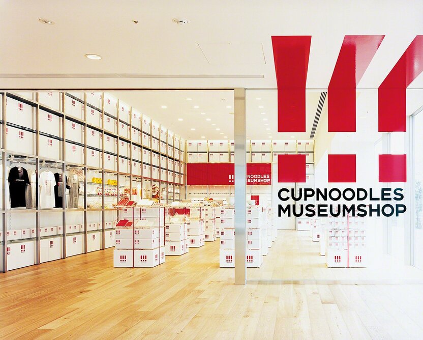 The museum shop at the Cup Noodles Museum. Satō also designed many of the goods sold there.
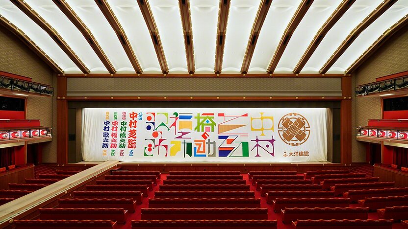
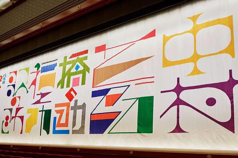 The Kabukiza curtain designed by Satō to celebrate the name succession (shūmei) of kabuki actor Nakamura Shikan VIII.

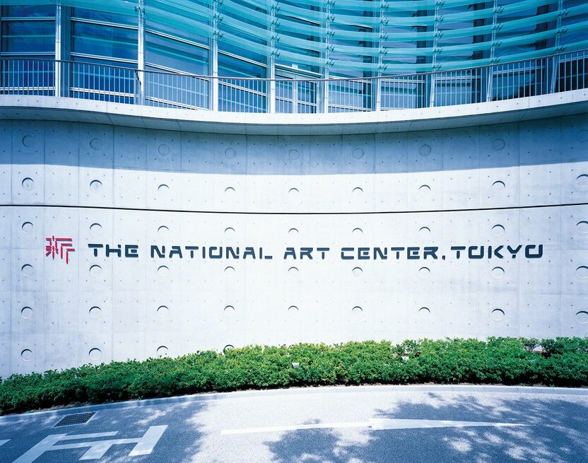
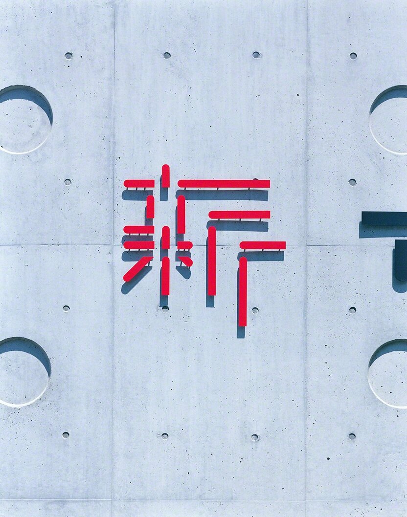 Satō’s logo for the National Art Center, Tokyo, in Roppongi.
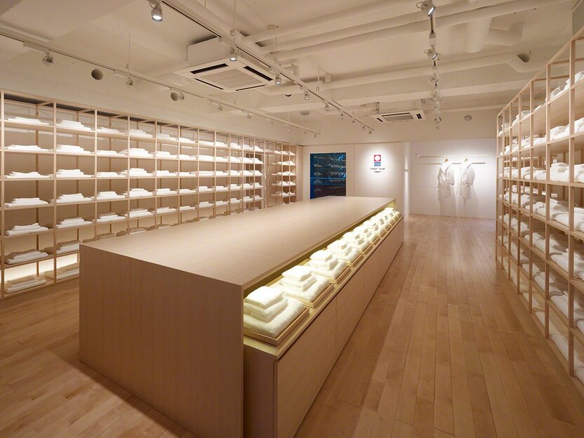 As creative director of the Imabari towels branding project, Satō designed a striking new logo and produced the first flagship store, located in the fashionable Minami-Aoyama district of Tokyo.
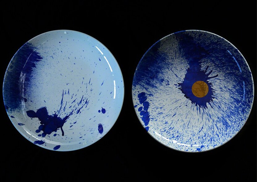 For the Arita 400 project, launched in 2016 to commemorate the 400th anniversary of Arita porcelain, Satō collaborated with several Arita potters on a series titled “Dissimilar” using the “splash painting” technique.
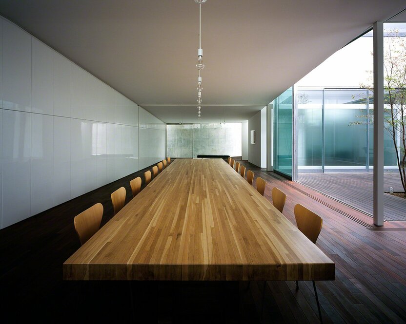 Conference room in Satō Kashiwa’s studio, Samurai, in Tokyo’s Shibuya district.




 Read in other languages